


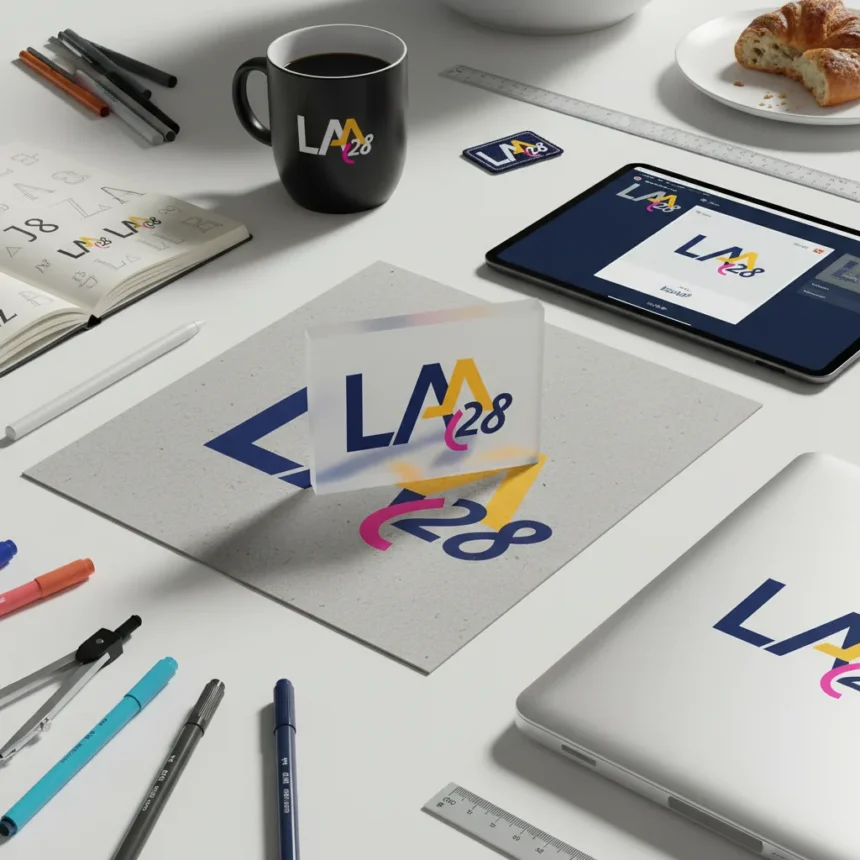
LA28 Olympic branding proves that typography, often dismissed as a support player in identity design, can anchor an entire cultural platform. Rather than designing a static logo, the Los Angeles 2028 Olympics team created a scalable system centered on custom typefaces and a customizable emblem that reflects the city’s diversity and invites creative contribution from athletes, artists, and community members.
Key Takeaways
- LA28 emblem features fixed “L” and “28” with an interchangeable “A” designed by community members, athletes, and artists.
- Supersbloom motif comprises 13 interlocking patterns inspired by LA’s wildflower phenomenon, applied across broadcast, digital, and stadium environments.
- Custom typefaces and vibrant colors create emotional recall, aiming for permanent visual memory beyond the temporary event.
- Type-forward approach contrasts with Paris 2024’s patchwork graphic style and 1984 LA Olympics’ simpler visual language.
- Games run July 21 to August 6, 2028, marking LA’s first Olympic return since 1984.
Why LA28’s type-forward approach breaks the Olympic branding mold
Ric Edwards, VP of Brand Design at LA28, articulated the stakes plainly: “You might not remember every record-breaking moment. But you remember how the Games looked.” This philosophy inverted conventional Olympic branding hierarchy. Rather than treating typography as a utility—supporting imagery, photography, and graphic flourishes—LA28 positioned it as the identity’s foundation. The decision reflects a broader industry shift: in a fragmented media landscape where the Games will appear on broadcast screens, mobile apps, stadium signage, and social platforms simultaneously, a type-forward system offers flexibility that ornamental logos cannot match.
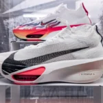
Charles Nix, Monotype’s senior executive creative director, emphasized typography’s “underrated power” in building brands that stick. LA28 Olympic branding demonstrates this principle through custom typefaces that feel distinctly Los Angeles—energetic, contemporary, and rooted in the city’s creative heritage. The typefaces work at scale, from massive stadium installations to tiny mobile icons, without losing character or legibility.
The customizable emblem: from fixed structure to infinite expression
The core emblem structure locks down only two elements: the “L” and “28” remain constant, while the “A” rotates through designs contributed by athletes, artists, community members, and figures from entertainment and economics. This design choice transforms a logo from a static brand asset into what LA28 calls “a platform for creativity, self-expression, and inclusion.” Rather than gatekeeping the visual identity, the organization distributed creative authority across the community.

The emblem’s flexibility acknowledges a fundamental truth about Los Angeles: the city resists singular definition. From Venice to the San Fernando Valley, LA contains multitudes. A fixed logo would flatten that complexity. An interchangeable emblem honors it. Early contributor designs have already demonstrated how the system accommodates everything from minimalist geometric approaches to detailed illustrative styles, all unified by the anchoring “L” and “28”.
Supersbloom: the graphic system that captures LA’s essence
At the identity’s core sits the Supersbloom motif—13 interlocking patterns inspired by the rare wildflower phenomenon that blankets Southern California deserts. Each pattern forms an infinite loop, symbolizing people, life, and culture in continuous cycle. This graphic system scales across the entire Games ecosystem: broadcast graphics, digital platforms, stadium environments, and printed materials. The Supersbloom patterns avoid the trap that snared Paris 2024’s branding, which relied heavily on patchwork shapes and multi-color assets that, while vibrant, risked visual fatigue across dozens of touchpoints.


The Supersbloom system succeeds because it balances constraint with flexibility. The 13 patterns provide enough variety to feel fresh across thousands of applications without requiring infinite custom design work. This scalability matters enormously for an event of the Games’ magnitude—broadcast designers, digital teams, and environmental graphics teams need a system they can deploy without constant creative reinvention.
How LA28 Olympic branding learned from 1984 without copying it
The 1984 Los Angeles Olympics set a visual precedent that LA28 could not ignore. That Games produced iconic imagery—bold sans-serif typefaces, primary colors, geometric forms—that defined the 1980s aesthetic. Rather than resurrect 1984’s visual language directly, LA28 studied what made it work: clarity, boldness, and a willingness to embrace color and typography as primary storytelling tools.
LA28 Olympic branding evolved that DNA for 2028. The custom typefaces feel contemporary rather than retro. The Supersbloom motif connects to LA’s natural landscape in ways 1984 could not have anticipated. The customizable emblem reflects modern values around inclusion and community contribution that were not central to Olympic branding three decades ago. The result feels like a continuation of a tradition rather than a nostalgic repeat.
The scalability challenge: testing type-forward design at Olympic scale
Designing for a single poster is one problem. Designing a coherent identity that works on broadcast graphics, digital platforms, stadium-scale environments, and merchandise simultaneously is another entirely. Ric Edwards and the LA28 design team pressure-tested the branding across this enormous range, building a scalable design system from scratch. The type-forward approach proved advantageous here: custom typefaces remain legible and distinctive whether rendered at 12 points on a mobile screen or 50 feet tall on a stadium facade.


This scalability addresses a real weakness in many Olympic branding systems. Identities designed primarily around complex graphic elements or intricate illustrations often break down when enlarged or reduced. Type-forward systems, by contrast, maintain their integrity and impact across scales. LA28 Olympic branding demonstrates this principle in practice.
What does LA28 Olympic branding mean for sports branding beyond 2028?
LA28 Olympic branding signals a shift in how major sporting events think about visual identity. Rather than designing a logo that will appear in highlight reels and merchandise, LA28 created a platform that invites participation and evolves across applications. This approach aligns with broader trends in brand design: flexibility, inclusivity, and systems thinking matter more than singular iconic marks.
The type-forward strategy also suggests that in an era of content fragmentation, typography offers stability. A well-designed custom typeface works across mediums in ways that illustration or photography cannot. It scales, it remains legible, and it carries cultural meaning. For future Olympic Games, World Cups, and major sporting events, LA28 Olympic branding may serve as a template: prioritize type, build systems over logos, and create room for community contribution.
Will LA28 Olympic branding actually achieve emotional recall?
The stated goal is ambitious: to create emotional recall that outlasts the Games themselves, embedding LA28 Olympic branding in cultural memory as a permanent visual marker. Whether a branding system can achieve this remains unverified until after the Games conclude in August 2028. The design is strong, the system is thoughtful, and the philosophy is sound—but emotional embedding is ultimately determined by viewers, not designers.
How does the customizable emblem actually work in practice?
The “A” in the LA28 emblem rotates through designs created by athletes, artists, and community members. Each version maintains the visual system’s core elements while allowing individual interpretation and creative expression. This approach celebrates LA’s diversity while keeping the mark recognizable.
When do the LA28 Olympics take place?
The Games run from July 21 to August 6, 2028, in Los Angeles. This marks the first time LA has hosted the Olympics since 1984, making the branding’s connection to that Games’ legacy particularly resonant.
LA28 Olympic branding succeeds because it treats design as a system rather than a singular mark. By centering typography, building scalability into the foundation, and creating space for community contribution, the identity avoids the trap that snares many Olympic branding efforts: becoming a static artifact rather than a living platform. Whether it achieves permanent cultural embedding remains to be seen—but the approach itself represents a meaningful evolution in how major sporting events think about visual identity.
This article was written with AI assistance and editorially reviewed.
Source: Creativebloq