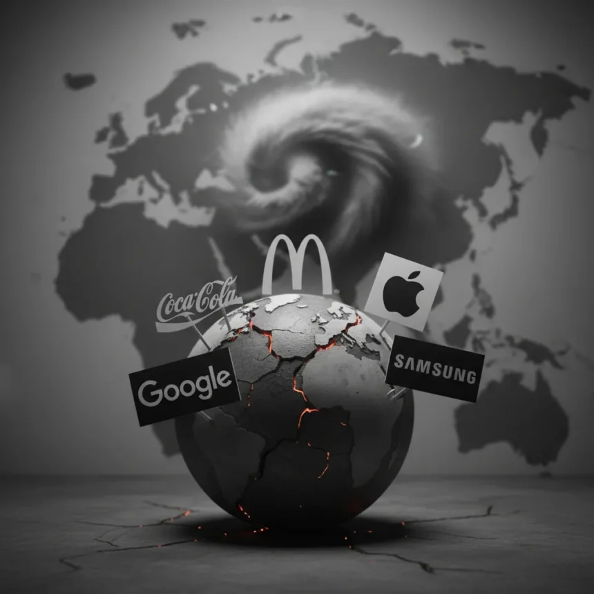
Brand identity design has always been tested in the marketplace, but a potential Iran conflict could introduce an entirely new kind of pressure: the geopolitical kind. Creative Bloq’s recent analysis poses a provocative question: what if major brands suddenly had to abandon their signature colours because using them became inappropriate or even dangerous in certain markets?
Key Takeaways
- Geopolitical crises could force brands to operate without their signature colours, creating a real-world stress test for logo strength.
- Strong brand identity design relies on more than colour alone—shape, typography, and symbol recognition matter equally.
- Colour-dependent branding strategies may prove fragile when external conditions change rapidly.
- The best logos remain recognizable even when stripped of their primary colour palette.
- This scenario highlights why foundational brand identity design principles matter more than visual shortcuts.
The Colour Dependency Problem in Modern Brand Identity Design
Most contemporary brand identity design leans heavily on colour as a recognition shortcut. Think of the brands you recognize instantly—Coca-Cola’s red, Facebook’s blue, Taco Bell’s purple. These colours are so integral to their brand identity design that removing them feels almost impossible. Yet in a crisis scenario, that dependency becomes a vulnerability.
The premise is straightforward: if geopolitical conditions made certain colours taboo or inappropriate in key markets, brands would face a choice. Either abandon those markets or rebuild their brand identity design from scratch using alternative visual languages. This is not a hypothetical exercise in logo redesign—it is a test of whether the underlying brand identity design is strong enough to survive without its most recognizable asset.
A strong brand identity design should work across contexts. Logos that rely exclusively on colour to differentiate themselves from competitors are inherently fragile. The shape, the typography, the negative space, the symbolic meaning—these elements should carry equal weight. When colour is removed or restricted, does the logo still communicate? Does the brand still feel like itself?

What Makes Brand Identity Design Resilient
The most resilient brand identity design typically shares certain characteristics. First, it functions in monochrome. A logo that looks like a grey blob when colour is stripped away has failed the fundamental test. Second, it avoids relying on subtle colour gradations or complex palettes that cannot translate to restricted environments. Third, it builds recognition through distinctive shapes and symbols rather than through colour alone.
Consider logos that have survived decades of use, rebranding, and market shifts. The strongest examples share a common trait: they are immediately recognizable even when rendered in a single colour or displayed at tiny sizes. This is not accidental. It is the result of disciplined brand identity design that prioritizes clarity and distinctiveness over decorative flourish.


A geopolitical crisis that restricts colour use would separate the well-designed logos from the ones that cut corners. Brands with shallow brand identity design—those that treated colour as a substitute for actual distinctive character—would struggle. Those that built their identity on strong foundational elements would adapt more easily.
The Broader Lesson for Brand Identity Design Strategy
This scenario, while speculative, reveals something important about how brands should approach brand identity design in an uncertain world. Resilience matters. A brand identity design that works only under ideal conditions is not actually a strong identity at all.
Companies invest heavily in their visual identities, but many treat brand identity design as a marketing exercise rather than a strategic asset. The difference is critical. A marketing exercise produces something that looks good in campaign materials. A strategic asset produces something that survives constraints, adapts to new contexts, and remains recognizable across decades and disruptions.
The Iran conflict scenario is extreme, but the principle applies to everyday challenges too. A brand identity design must work on a billboard and on a favicon. It must function in colour and in monochrome. It must translate across cultures and across platforms. These are not optional refinements—they are core requirements of professional brand identity design.


Could This Actually Happen?
The question of whether brands would actually face colour restrictions in a conflict scenario is open. Companies often maintain separate visual strategies for different markets and contexts. But the intellectual exercise is valuable regardless of its likelihood. It forces designers and brand strategists to ask harder questions about what makes their brand identity design actually work.
If your brand identity design depends entirely on colour, you have identified a weakness. If it survives every constraint you can imagine—monochrome, small scale, fast rendering, cross-cultural use—then you have built something durable. That durability is what separates brands that last from brands that fade when conditions change.
FAQ
What is brand identity design exactly?
Brand identity design encompasses all the visual elements that represent a company or product: logos, colour palettes, typography, imagery, and design patterns. It is the complete visual language that communicates what a brand stands for and makes it recognizable to audiences.
Why does colour matter so much in brand identity design?
Colour is one of the fastest visual recognition triggers. It is easier to remember a brand by its colour than by its shape alone. However, overreliance on colour creates fragility—if that colour becomes unavailable or inappropriate, the entire brand identity design becomes harder to recognize.
Could real brands actually be forced to change their colours?
While a full colour ban is unlikely, brands do modify their visual strategies in response to cultural sensitivities, market regulations, and crisis conditions. The scenario raises a legitimate question about how prepared brands are to adapt their brand identity design if circumstances demand it.
The Iran conflict scenario may never materialize, but it serves a useful purpose: it reminds designers and brand strategists that the strongest brand identity design is not the most colourful or the most trendy. It is the most resilient. It is the identity that survives constraints, adapts to new conditions, and remains unmistakably itself across any context. That is the standard that separates amateur branding from professional brand identity design.
Edited by the All Things Geek team.
Source: Creativebloq