



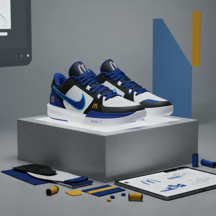
Nike’s special-edition Book 2 McDonald’s blue logo collaboration is a bold departure from fast-food branding convention. The shoes, inspired by the world’s most unusual McDonald’s restaurant design, swap the brand’s iconic golden arches for a striking blue treatment that immediately signals something different from standard corporate partnerships.
Key Takeaways
- Nike Book 2 shoes feature McDonald’s logo reimagined in blue instead of traditional yellow
- The design draws inspiration from an architecturally distinctive McDonald’s location
- Blue was established as a distinguishing trademark element through design filing
- The collaboration marks a departure from McDonald’s standard visual identity
- The shoe represents crossover appeal between footwear and fast-food branding
Why Nike chose blue for the McDonald’s logo
The blue logo treatment on the Nike Book 2 isn’t arbitrary branding confusion. A trademark filing established blue as a distinguishing design feature, giving Nike legal and creative grounds to reimagine the McDonald’s visual identity for this special-edition collaboration. This approach allows the shoe to celebrate the McDonald’s brand while creating visual separation from everyday fast-food packaging and signage.
The choice reflects a broader design philosophy: when a legendary brand like McDonald’s collaborates with a footwear innovator like Nike, the partnership demands visual distinctiveness. Standard golden arches would blend into typical sneaker aesthetics. Blue creates immediate recognition and intrigue, signaling to collectors and sneaker enthusiasts that this is not a routine co-branded release.
The architectural inspiration behind the design
The Nike Book 2 draws from an unusually designed McDonald’s restaurant, a location that breaks from the chain’s typical architectural template. McDonald’s original logo, dating to 1961, itself referenced the restaurant’s distinctive architecture, designed by Stanley Meston. This historical connection between McDonald’s visual identity and physical building design creates a thematic bridge for Nike’s approach.

By grounding the collaboration in a specific, unconventional McDonald’s location rather than generic brand imagery, Nike elevated the partnership beyond a simple logo slap. The blue treatment becomes part of that architectural narrative—a contemporary reinterpretation of how McDonald’s visual language can adapt when placed in unexpected contexts, like premium sneaker design.
How this breaks McDonald’s branding tradition
McDonald’s has maintained extraordinary consistency in its visual identity for decades. The golden arches represent one of the world’s most recognizable symbols, instantly triggering associations with the brand across continents. The Nike Book 2 collaboration deliberately challenges that consistency by introducing blue as a primary color element.



This is not a mistake or corporate confusion. Instead, it reflects a deliberate design decision to create something that honors McDonald’s heritage while refusing to replicate it exactly. The blue logo signals that this product exists in a different category—not fast-food merchandise, but premium collaborative footwear. Sneaker collectors recognize the visual code: when a major brand’s colors shift unexpectedly, exclusivity and limited availability typically follow.
What this means for brand collaborations
The Nike Book 2 McDonald’s collaboration demonstrates how modern partnerships can recontextualize established brand elements. Rather than simply placing one logo on another brand’s product, Nike and McDonald’s created a design narrative that justifies visual transformation. The blue treatment becomes a design decision, not a branding error.
This approach opens possibilities for future collaborations. When two brands with distinct visual languages merge, designers now have permission to adapt, reinterpret, and reimagine rather than simply combine. The Nike Book 2 shows that audiences—particularly sneaker and design enthusiasts—appreciate thoughtful reinterpretation over literal brand application.
Is the blue logo a permanent McDonald’s change?
No. The blue treatment is exclusive to the Nike Book 2 collaboration and does not signal any shift in McDonald’s corporate visual identity. The golden arches remain the brand’s primary trademark globally. This special-edition shoe represents a one-off creative partnership, not a brand evolution.



Why would Nike collaborate with McDonald’s on sneakers?
Sneaker collaborations succeed when they bridge unexpected audiences. McDonald’s represents global recognition and nostalgia; Nike represents athletic innovation and design excellence. Together, they reach collectors who appreciate cultural crossover and limited-edition releases. The unusual McDonald’s location inspiration adds depth beyond simple logo placement.
Will there be other colors or versions of this shoe?
The research brief does not specify whether additional colorways or versions are planned. The blue logo treatment appears to be the defining visual element of this particular collaboration, but future releases or variants could explore different design directions while maintaining the core partnership concept.
The Nike Book 2 McDonald’s blue logo collaboration represents a moment where heritage branding meets contemporary sneaker culture. By reimagining McDonald’s visual identity in blue rather than replicating its iconic golden arches, Nike created something that works across both worlds—honoring the fast-food giant’s design history while establishing a distinct product identity. For sneaker enthusiasts and design observers, the blue treatment signals that this partnership was thoughtfully conceived, not hastily assembled. That intentionality is what separates memorable collaborations from forgettable marketing exercises.
Edited by the All Things Geek team.
Source: Creativebloq