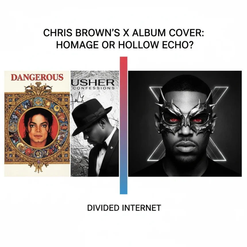
The album cover design debate surrounding Chris Brown’s tenth studio album X has split the internet since its June 2014 reveal. The black-and-white portrait features Brown with dramatic chiaroscuro lighting, heavy shadows across one side of his face, and an intense gaze that immediately recalls Michael Jackson’s Bad cover from 1987 and Usher’s Confessions from 2004. Within hours of the Instagram reveal, fans and design critics clashed: is this a knowing homage to R&B’s golden era, or a shortcut masquerading as respect?
Key Takeaways
- Chris Brown’s X cover uses chiaroscuro lighting and shadowed portraiture similar to Michael Jackson’s Bad (1987) and Usher’s Confessions (2004).
- Fan reactions split sharply between praise for iconic homage and criticism of design laziness on Twitter and Instagram.
- The album cover design debate highlights tension between artistic influence and pastiche in music branding.
- Album X scheduled for September 16, 2014 release via RCA Records after initial delay.
- Brown posted the cover with caption: X. 9-16-14. The wait is almost over.
Why the Album Cover Design Debate Matters Now
Timing amplified the stakes. Brown was rebuilding his public image in 2014 after legal troubles, and his visual choices became scrutinized as signals of artistic maturity or continued missteps. A cover that borrows too heavily from past legends risks reading as a statement that Brown has nothing new to say visually. Yet the album cover design debate also reflects a deeper question in music marketing: when does referencing become stealing?
Creative Bloq’s Joe Foley framed it directly: Is it a knowing wink to R&B’s golden era, or just a shortcut to looking cool? That question captures the entire argument. A homage requires intentionality and context—the artist must earn the reference through originality elsewhere. A pastiche is hollow borrowing dressed up as respect. The album cover design debate hinges on which side of that line Brown lands.
The Visual Evidence: Michael Jackson’s Shadow
The comparison to Michael Jackson’s Bad is unavoidable. Nancy Pitman’s 1987 design placed Jackson in a black suit against a dark background, with his left eye shadowed and his expression severe. Brown’s X cover mirrors this almost exactly: black suit, dark background, shadowed left eye, unsmiling intensity. The pose is nearly identical. Fans defending the album cover design debate note that both images channel the same artistic tradition—dramatic portraiture as a statement of power and seriousness. Marvin Gaye’s Let’s Get It On (1973) pioneered this high-contrast portrait style in R&B, so the lineage is real.

But lineage and direct imitation are not the same. Usher’s Confessions, designed by Wyclef Jean, also uses dramatic lighting and brooding intensity, yet it distinguishes itself through compositional choices and Usher’s unique facial expression. Brown’s X cover does not make those distinctions. The shadowed eye, the tilt of the head, the severity of expression—all echo Jackson so closely that the album cover design debate becomes inevitable.
How Brown’s Prior Work Complicates the Argument
Brown’s 2012 album Fortune offers a useful contrast. That cover was colorful, stylized, and visually distinct—a design choice that proved Brown’s team could execute originality when they chose to. So why retreat to chiaroscuro homage for X? The album cover design debate gains weight from this context. If Brown had consistently borrowed from R&B legends, the pattern would read as a signature aesthetic. Instead, the shift to Jackson-adjacent portraiture on X reads like a calculated play for gravitas rather than a genuine artistic statement.


Fan reactions on Twitter and Instagram crystallized this tension. Supporters tweeted, Chris Brown channeling MJ on that #X cover. Respect! Critics fired back: Lazy rip-off of Bad. Chris, hire an original designer. Neither side was entirely wrong. The album cover design debate was not about whether Brown could reference Jackson—he can—but whether the reference was earned or expedient.
What the Album Cover Design Debate Reveals About Music Marketing
The X cover reveal exposed a broader industry vulnerability: graphic design for music is often treated as a secondary concern, a box to check rather than a statement to craft. Major labels push album artwork to market quickly, relying on established visual codes—dramatic portraits, high contrast, serious expressions—because those codes signal quality and seriousness to consumers. The album cover design debate around X suggests that formula is wearing thin. Fans now expect visual originality as part of an artist’s overall brand, not just a supporting element.
Brown’s X was scheduled for September 16, 2014 release, giving him months to refine the visual identity. The fact that the final cover landed so close to Jackson’s 1987 work suggests either a deliberate choice to invoke that era, or a missed opportunity to push further. The album cover design debate will likely persist until X ships and listeners judge the music itself. Sometimes a great album redeems a derivative cover. Sometimes it amplifies the feeling that the artist took shortcuts everywhere.
Is borrowing from legends ever acceptable in music design?
Yes, but only with clear intentionality and visual distinctiveness. A designer can reference Jackson’s Bad and still create something original—different lighting angles, unexpected color, unconventional composition. The album cover design debate around X hinges on Brown’s team making minimal changes to a proven formula. Homage requires showing your work; pastiche hides behind it.


How does X compare to other R&B comebacks visually?
Brown’s earlier Fortune cover proved he could execute bold, colorful design. X retreats to safer dramatic portraiture, which reads as less ambitious. Other R&B artists returning from controversy have chosen more distinctive visual strategies, making the album cover design debate around X feel like a missed chance to signal growth beyond the music itself.
Will the album cover design debate affect X’s commercial performance?
Unlikely. Album artwork influences initial perception but not long-term sales. Listeners who connect with the music will overlook a derivative cover. Those skeptical of Brown will see the album cover design debate as evidence of laziness. The cover is a signal, not a dealbreaker—but signals matter when an artist is rebuilding trust.
The album cover design debate around Chris Brown’s X ultimately reflects a simple truth: visual identity is part of an artist’s statement, not separate from it. A cover that borrows too heavily from Jackson and Usher without adding something new reads as a choice to play it safe when safety is the last thing a comeback needs. Whether that choice costs Brown in the long run depends on what the music itself delivers.
Edited by the All Things Geek team.
Source: Creativebloq