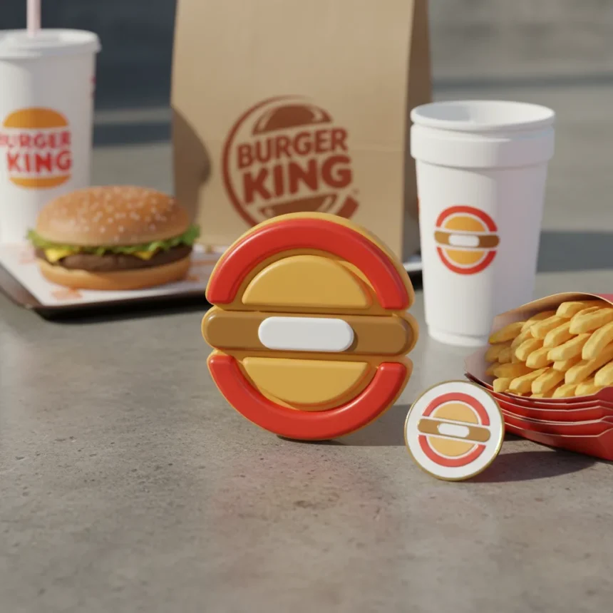
The Burger King rebrand stands as the decade’s most decisive design overhaul, proving that heritage brands can shed dated aesthetics without abandoning their identity. In 2021, Jones Knowles Ritchie undertook a comprehensive visual transformation that touched everything from packaging to menu design, merchandise, and restaurant decor. The rebrand was not a reinvention—it was a restoration with teeth.
Key Takeaways
- Burger King’s 2021 rebrand revived the iconic 1969 logo with modern refinement and flat design principles
- Jones Knowles Ritchie led the project, introducing new typeface and bold geometric shapes across all touchpoints
- The rebrand extended beyond logo work to packaging, menus, merchandise, and in-store decor
- Creative Bloq named it Rebrand of the Decade, recognizing its impact on fast-food visual strategy
- The project balanced nostalgia with contemporary design language, avoiding the trap of over-modernization
Why the Burger King Rebrand Succeeded Where Others Failed
Most fast-food rebrands stumble because they chase trends instead of anchoring to heritage. The Burger King rebrand, led by global executive creative director Lisa Smith at JKR, took the opposite approach. Rather than scrapping the 1969 logo entirely, the team excavated what made it work and translated it into a language that felt current without feeling hollow. The flat design approach and bold geometric shapes became the visual grammar across every customer touchpoint.
The new typeface was not an afterthought—it was central to the rebrand’s coherence. Typography carries emotional weight in fast-food branding, signaling either energy or reliability. Burger King’s new letterforms achieved both, creating a system that worked equally well on a billboard and a receipt. This is where most rebrands fail: they optimize for one medium and ignore the others. The Burger King rebrand was obsessively systematic.
What separated this project from the noise of competing rebrand announcements was its scope. Packaging redesign alone can feel like window dressing. But when you extend the visual language to menu boards, merchandise, and the physical restaurant environment, you force yourself to solve real design problems. Can your new logo work at 2 inches tall on a napkin? Can it dominate a 20-foot wall? The Burger King rebrand answered yes to every question.

The Burger King Rebrand’s Competitive Advantage in Fast-Food Design
Fast-food branding typically divides into two camps: maximalist chaos (bright colors, competing shapes, sensory overload) and minimalist restraint (flat colors, simple marks, corporate blandness). The Burger King rebrand found a third path by pairing bold, confident geometry with disciplined color and whitespace. This gave the brand permission to feel energetic without appearing chaotic—a balance that competitors like McDonald’s, despite its own packaging efforts, have struggled to achieve.
The rebrand also demonstrated that heritage need not mean stagnation. Burger King’s 1969 logo was iconic, but it carried visual baggage from decades of inconsistent application. The 2021 rebrand cleaned that up without erasing the lineage. The crown remained recognizable; the letterforms felt fresh. This is the hardest design problem: how to evolve without breaking the thread of identity that customers recognize at a glance.


Recognition and Industry Impact of the Burger King Rebrand
Creative Bloq recognized the Burger King rebrand as Rebrand of the Decade, an accolade that reflected not just aesthetic excellence but strategic clarity. The award acknowledged that great branding is not about decoration—it is about solving a business problem with visual language. Burger King’s problem was this: how do we feel contemporary to Gen Z while remaining accessible to families who have eaten here for forty years? The rebrand solved that by creating a visual system flexible enough to speak to both audiences simultaneously.
The project’s influence rippled through the industry. Other major brands began scrutinizing their own logo systems, asking whether they had made similar compromises between heritage and modernity. The Burger King rebrand became a case study in how to modernize without abandoning equity—a lesson that resonated far beyond fast food.
Why the Burger King Rebrand Matters Now
As of the mid-2020s, the Burger King rebrand has aged remarkably well. Many rebrands from the early 2020s already feel dated, victims of trend-chasing or over-design. The Burger King rebrand endures because it was built on principles, not fashions. The flat design language, the geometric confidence, the restrained color palette—these were not borrowed from Pinterest. They were derived from the brand’s own archive and updated with contemporary craft.
The rebrand also proved that you do not need to hire a celebrity designer or chase viral moments to create impact. Lisa Smith and the team at JKR executed a systematic, thorough overhaul that spoke through consistency rather than spectacle. In an era of rebrands that announce themselves loudly and then disappear, the Burger King rebrand has become quieter and stronger with age.


Is the Burger King rebrand still the best of the 2020s?
Yes, measured by execution and longevity. The rebrand has not aged poorly, remained coherent across all applications, and solved the core business problem—making a legacy brand feel current without alienating existing customers. Other rebrands from the decade have been more experimental or more talked-about, but few have been as strategically sound and visually disciplined.
What specific changes did the Burger King rebrand include?
The rebrand introduced a modernized logo reviving the 1969 design, a new custom typeface, flat design principles, and bold geometric shapes. These changes extended across packaging, menu design, merchandise, and restaurant decor, creating a cohesive visual system rather than a logo-only refresh.
Who designed the Burger King rebrand?
Jones Knowles Ritchie led the project, with Lisa Smith serving as global executive creative director. The team approached the rebrand as a systematic overhaul, not a cosmetic update, ensuring consistency across every customer touchpoint.
The Burger King rebrand endures as the decade’s most convincing proof that heritage and modernity are not enemies. By respecting the brand’s archive while speaking a contemporary visual language, JKR created a rebrand that feels neither nostalgic nor disconnected from its past. That balance—rare in an industry obsessed with disruption—is why it remains the standard against which other fast-food rebrands are measured.
Edited by the All Things Geek team.
Source: Creativebloq