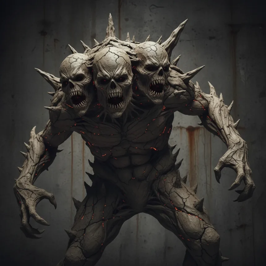
The new Clayface poster body horror design is deliberately grotesque, featuring melting flesh, exposed teeth, and asymmetrical features that linger in viewers’ minds precisely because they are viscerally uncomfortable to witness. This approach to villain marketing represents a sharp departure from the polished, heroic aesthetics that have dominated mainstream superhero promotional material for decades.
Key Takeaways
- The Clayface poster body horror design uses dripping clay textures and distorted facial features to create sustained discomfort.
- High-contrast lighting and viscous texture effects amplify the grotesque impact, making the poster deliberately difficult to look at.
- Body horror in marketing proves more memorable than sanitized superhero posters by triggering visceral psychological responses.
- The tagline “Face your fears” in distorted font reinforces the poster’s thematic commitment to unease.
- This approach contrasts sharply with previous DC villain teasers that relied on subtle menace rather than explicit grotesqueness.
Why Clayface poster body horror works as marketing
Effective villain marketing requires the audience to feel something beyond admiration. The Clayface poster body horror design achieves this by making discomfort the entire point. Rather than presenting the character as a sleek threat or mysterious figure, the poster forces viewers to confront raw, melting flesh and asymmetrical features that violate basic expectations of human form. This visceral approach triggers a psychological response that lingers far longer than conventional poster design.
The body horror is so viscerally unsettling that it stays in your mind long after you’ve scrolled past, according to design analysis of the poster. The texture work—simulating melting skin through dripping clay effects—combines with high-contrast lighting to create an image that feels almost painful to process. Clayface, as a DC Comics villain with a shapeshifting mud and clay body dating back to his first appearance in Detective Comics #40, is inherently grotesque. The poster finally visualizes that grotesqueness without apology or softening.
How Clayface poster body horror differs from previous DC marketing
Earlier DC villain teasers, like the Riddler imagery from The Batman (2022), relied on subtle menace—atmospheric lighting, cryptic symbolism, and psychological unease. Those posters suggested threat without showing it explicitly. The Clayface poster body horror approach inverts this strategy entirely. Instead of hinting at something disturbing, it puts the disturbance directly in front of the viewer, forcing engagement rather than inviting contemplation.

This shift reflects a broader trend in DC’s post-Batman reboot phase, where gritty authenticity has begun replacing the glossy superhero template. Cleaner superhero posters—particularly Marvel’s Spider-Man series and similar franchises—maintain visual accessibility and broad appeal. They are designed to sell tickets without alienating casual audiences. The Clayface poster body horror design, by contrast, accepts that alienation as a feature, not a bug. It signals that this character, this story, will not be comfortable or easy to watch.
Body horror influences in the Clayface poster design
The visual language of the Clayface poster body horror draws from established body horror cinema. Films like The Thing (1982) and Society (1989) pioneered the visceral melting flesh effects that the poster echoes. Those films understood that grotesque transformation, rendered with technical detail, generates a primal discomfort that dialogue and plot cannot match. The Clayface poster applies that same principle to a single image: the character’s face becomes the entire narrative, and that narrative is one of dissolution and wrongness.


The distorted font used for the tagline “Face your fears” reinforces this commitment to visual unease. Typography is typically functional, meant to be read quickly and forgotten. Here, the letterforms themselves become distorted, mirroring the poster’s central image. Every element—flesh, teeth, lighting, text—works in concert to create a unified experience of discomfort. This level of thematic coherence is rare in mainstream superhero marketing, where poster design often treats imagery and typography as separate problems.
Why unsettling design beats sanitized alternatives
Villain marketing faces a fundamental challenge: how do you make an antagonist memorable without making them sympathetic? Sanitized designs fail because they strip away what makes a villain interesting. A villain is supposed to represent something the audience fears or rejects. By making that rejection visual—by ensuring the audience feels something unpleasant—the poster does its job. The Clayface poster body horror design understands that effective villainy is not about being cool or mysterious. It is about being genuinely disturbing.
Social media response to the poster has centered on precisely this discomfort. Fans describe it as difficult to look at, as lingering in their minds, as something they cannot unsee. These are not criticisms in the context of villain marketing—they are endorsements. The poster has achieved memorability through visceral impact rather than through clever design tricks or celebrity appeal. In an era where thousands of promotional images compete for attention daily, an image that makes people uncomfortable enough to discuss it has won the marketing battle before the film even arrives.
Does body horror in posters actually sell tickets?
Body horror in marketing is inherently risky. It can alienate casual audiences, trigger genuine distress, and generate negative social media reactions. However, the Clayface poster body horror approach targets a specific audience: fans who want villain stories that do not sanitize or soften their antagonists. For that audience, grotesque design is not a barrier to engagement—it is a promise that the filmmakers take the character seriously. The poster signals that this will not be a joke or a redemption arc. This is a creature made of clay, and the poster shows you exactly what that means.


FAQ
What makes the Clayface poster body horror design effective?
The poster’s grotesque imagery—melting flesh, exposed teeth, asymmetrical features—creates visceral discomfort that lingers psychologically. This approach proves more memorable than sanitized superhero posters because it triggers genuine emotional responses rather than relying on cool aesthetics or mystery.
How does the Clayface poster compare to other DC villain marketing?
Previous DC villain teasers like the Riddler imagery used subtle menace and atmospheric design. The Clayface poster body horror design inverts this by presenting grotesqueness directly and without apology, reflecting DC’s shift toward grittier, more authentic storytelling post-Batman (2022).
Is body horror marketing a trend in superhero films?
Body horror remains uncommon in mainstream superhero marketing, which typically prioritizes broad appeal and visual accessibility. The Clayface poster represents a deliberate rejection of that template, signaling a willingness to alienate casual audiences in favor of deeper engagement with committed fans.
The Clayface poster body horror design succeeds because it refuses compromise. In an industry built on making everything appealing to everyone, a poster that deliberately unsettles proves refreshingly honest about what the character is and what audiences should expect. Effective marketing does not always mean making people comfortable—sometimes it means making them feel something real.
Edited by the All Things Geek team.
Source: Creativebloq