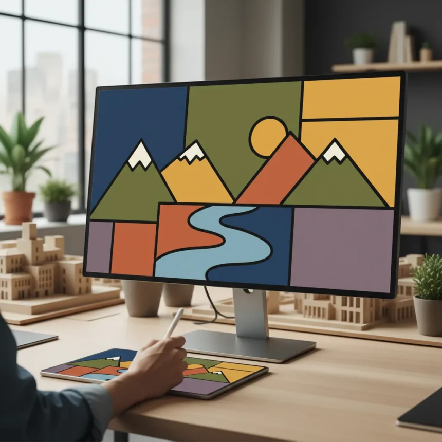
Colour blocking in illustration is a compositional strategy that groups similar hues into unified areas rather than scattering individual tones across a piece. This technique reduces visual noise, accelerates the painting process, and forces artists to make deliberate colour choices before diving into detail work.
Key Takeaways
- Colour blocking simplifies complex scenes by grouping hues into cohesive areas before adding detail.
- The technique forces intentional colour decisions early, preventing muddy or chaotic palettes.
- Large unified colour shapes read more clearly at thumbnail size and in distant viewing.
- Colour blocking works across digital painting, concept art, and stylised illustration.
- Separating colour decisions from rendering saves time and improves overall composition.
What Colour Blocking Does for Your Workflow
Colour blocking in illustration separates the colour decision phase from the rendering phase. Instead of painting local colours and shadows simultaneously, you establish broad colour areas first—treating each shape as a solid block of hue. This approach forces you to evaluate your overall palette and composition before getting lost in detail work. The result is cleaner colour harmony and faster iteration.
By committing to colour regions early, you avoid the trap of adding detail to areas that should have been adjusted at the compositional level. Many illustrators find that blocking colour first prevents the muddy, overwrought feeling that comes from layering too many conflicting hues in a single area. The technique also makes it easier to spot compositional imbalances—if a colour block feels too dominant or too recessive, you can adjust it before investing hours in rendering.
How Colour Blocking Strengthens Composition
Colour blocking in illustration works because large, unified shapes read faster than scattered details. At thumbnail size—a critical test for any composition—colour-blocked work maintains clarity because the eye grasps the overall colour structure instantly. This is especially valuable for concept art, game environments, and illustrations that need to communicate a mood or idea quickly.

The technique also reveals compositional problems that might be hidden by surface detail. If your colour blocks don’t create visual interest or guide the viewer’s eye effectively, no amount of rendering will fix it. Conversely, strong colour blocking can carry a piece even with minimal rendering, which is why many professional illustrators use this approach for speed and impact. The separation of colour from detail also makes it easier to experiment—you can swap colour blocks around without redrawing entire sections.
Practical Application in Digital Painting
In digital painting, colour blocking typically happens on a dedicated layer or layer group before any rendering begins. You establish flat colour areas using basic brushes and the eyedropper tool to maintain consistency. Once the colour blocks are locked in, you can create new layers above them for shadows, highlights, and texture without affecting the foundational colour structure.


This layering approach gives you flexibility—if a colour block isn’t working, you can adjust it globally without manually repainting every instance of that hue. Many digital painters also use colour blocking to test different lighting scenarios quickly. By duplicating the blocked layer and shifting hues, you can explore warm versus cool lighting or different times of day before committing to one direction. The technique scales from small character designs to sprawling environments, making it adaptable to any illustration project.
Why Colour Blocking Prevents Common Mistakes
Colour blocking in illustration prevents the common pitfall of adding local colour (the object’s inherent colour) without considering atmospheric perspective, lighting, or overall palette unity. When you block colour first, you’re making decisions about saturation, value, and temperature at a macro level. This prevents the scattered, unfocused feeling that comes from painting each object’s local colour independently.
The technique also discourages premature detail work. Many artists struggle with the urge to render small areas before the overall colour structure is sound. By committing to large blocks first, you establish a hierarchy of importance—what matters most gets colour-blocked first, and secondary elements follow. This prioritisation naturally leads to stronger compositions because your eye is drawn to the most important colour relationships before anything else.
Does colour blocking work for all illustration styles?
Colour blocking works for realism, stylisation, concept art, and graphic illustration. The technique is particularly effective for stylised work where colour shapes are intentionally bold, but it also strengthens realistic painting by forcing you to establish colour harmony before rendering light and shadow. The key is treating it as a foundational step, not a final product—you refine and add detail on top of the blocks.


How do you avoid flat-looking results when colour blocking?
Colour blocking establishes structure, not the finished piece. Once your blocks are in place, you layer rendering on top—adding shadows, highlights, texture, and detail. The blocks provide a colour-unified foundation that prevents muddy transitions. Many artists add subtle value shifts and temperature variations within blocks to avoid a poster-like appearance while maintaining the compositional clarity that blocking provides.
What’s the difference between colour blocking and flat design?
Flat design treats colour blocks as the final aesthetic, embracing bold, unified shapes as a stylistic choice. Colour blocking in illustration is a working method—the blocks are a means to an end, not the end itself. You use blocks to establish structure, then build rendering and detail on top. The two approaches overlap visually, but colour blocking is process-focused while flat design is style-focused.
Colour blocking in illustration is not a shortcut—it’s a deliberate reordering of your painting process that puts colour decisions before rendering decisions. This shift forces clarity, prevents wasted effort, and produces stronger compositions. Whether you’re painting environments, characters, or abstract scenes, establishing colour blocks first will sharpen your work and accelerate your workflow.
Where to Buy
£375 at Amazon | £28.47 at Amazon | £28.47 at Amazon | $39.95 at Amazon US | $186.98 at Amazon US
Edited by the All Things Geek team.
Source: Creativebloq