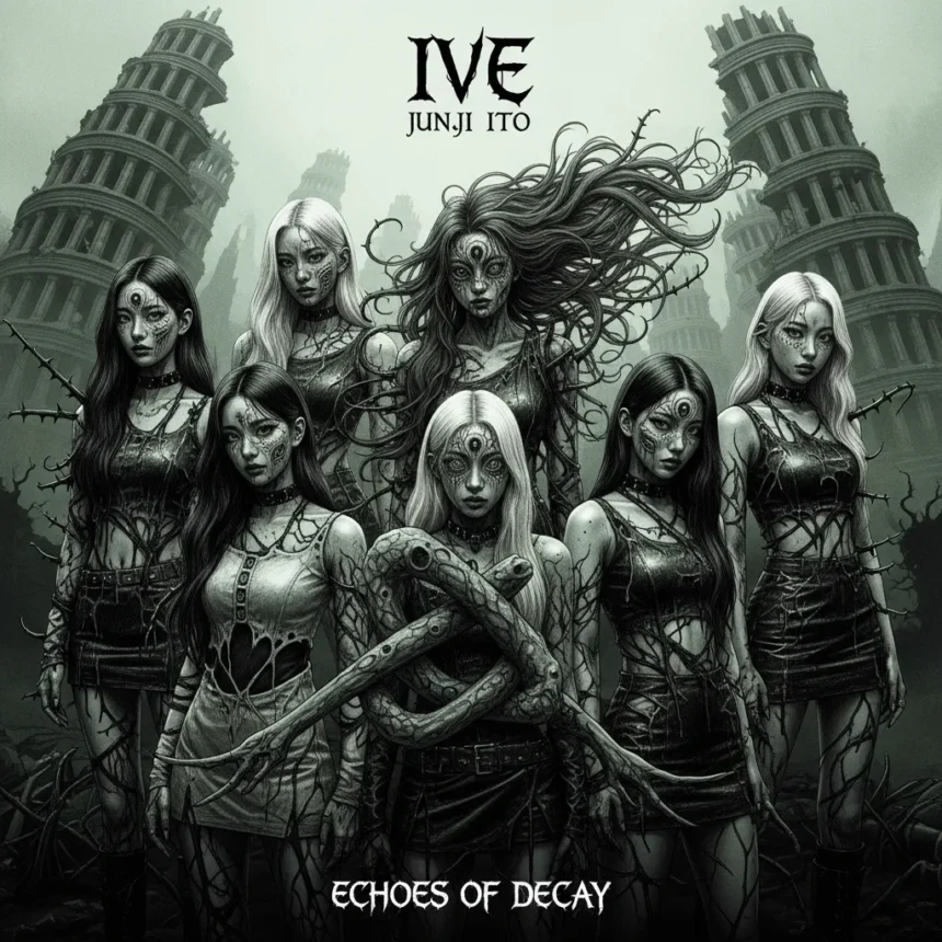
IVE’s new album cover represents a radical departure from Kpop convention, applying Junji Ito’s signature Junji Ito horror manga aesthetic to one of the industry’s most glamorous groups. The six members appear twisted, distorted, and deeply unsettling—a deliberate collision between mainstream idol culture and avant-garde horror that challenges everything fans expect from a Kpop release.
Key Takeaways
- IVE collaborated directly with Junji Ito, the Japanese horror mangaka behind Uzumaki and Tomie, for their IVE SWITCH album cover.
- The cover distorts IVE members’ faces with oversized hollow eyes, elongated necks, and impossible body angles.
- Junji Ito’s signature visual techniques include spiraling patterns, textural grotesqueness, and desaturated color palettes that evoke psychological dread.
- The cover deliberately subverts typical Kpop aesthetics, which prioritize glamour and polish over discomfort.
- This rare crossover between mainstream idol marketing and niche horror art sparked both fan fascination and backlash.
The Visual Language of Junji Ito Horror Manga Aesthetic
Junji Ito’s Junji Ito horror manga aesthetic relies on specific visual distortions that make the familiar grotesque. On IVE’s album cover, these techniques manifest as oversized, hollow eyes with displaced or absent pupils that create a dead stare effect. Members’ necks stretch unnaturally long, heads tilt at biomechanically impossible angles, and bodies twist into poses that violate human anatomy. The skin itself becomes a horror element, rendered with textures that reference Ito’s most iconic works—spiraling patterns evoke his manga Uzumaki, while parasitic growths suggest organic corruption.
The color palette amplifies the unease deliberately. Rather than the vibrant, saturated tones typical of Kpop album art, IVE SWITCH uses desaturated hues—sickly greens, blacks, and reds that drain vitality from every frame. The composition clusters the six members in a claustrophobic arrangement that invades personal space, mimicking Ito’s spiral motifs to create inescapable tension. Nothing feels safe. Nothing feels designed to sell.
Why This Collaboration Shocks Kpop Fans
Kpop’s visual language prioritizes aspirational beauty. BLACKPINK’s covers radiate polished glamour. BTS’s artwork emphasizes dynamic action and heroic proportions. The industry trains audiences to see idols as untouchable, aestheticized, perfect. IVE SWITCH obliterates that contract. By applying Junji Ito’s horror manga aesthetic, the album cover positions its members not as objects of desire but as subjects of dread. The dissonance is intentional and visceral.

This represents a rare moment where a global Kpop act—IVE commands over 10 million monthly Spotify listeners—deliberately chose artistic risk over commercial safety. The cover does not exist to attract casual listeners or casual merchandise buyers. It exists to provoke, to disturb, to force engagement with the uncomfortable. Some IVE fans embraced this boldness as artistic courage. Others found it traumatizing, a betrayal of the group’s established brand. That split reaction is precisely the point.
Junji Ito Horror Manga Aesthetic Applied to Idol Culture
Junji Ito’s body horror techniques gain new resonance when applied to idols. Kpop culture already subjects performers to extreme scrutiny of their physical forms—facial proportions, body weight, posture, skin texture. Ito’s distortions exaggerate this surveillance into nightmare. The oversized eyes suggest constant, invasive observation. The elongated limbs imply the stretching and contortion demanded by performance schedules. The melting faces evoke the psychological toll of maintaining perfection under relentless pressure.


The collaboration forces a confrontation with what idol culture demands and what it costs. By rendering IVE members through Junji Ito’s horror manga aesthetic, the cover transforms them from polished commodities into vulnerable, tormented figures. It is a statement about the industry itself, made visible through grotesque imagery. Whether intentional or not, the album art becomes a critique wrapped in horror.
How IVE SWITCH Compares to Other Kpop Horror Concepts
Other Kpop groups have explored darker aesthetics, but few have committed to genuine body horror. LOONA’s X X album presented surreal, dreamlike imagery—unsettling but abstract, maintaining a layer of beauty beneath the strangeness. aespa’s metaverse concepts create digital unease through futuristic alienation, not through grotesque transformation of human form. IVE SWITCH stands apart because it refuses compromise. The members are not stylized or filtered through digital abstraction. They are warped, distorted, made monstrous by Junji Ito’s unmistakable hand.
This positioning matters for Kpop’s visual evolution. The industry has explored gothic themes, supernatural concepts, and edgy aesthetics. But applying a horror mangaka’s signature style—with its specific emphasis on body horror and psychological dread—represents a threshold moment. It signals that Kpop is willing to embrace discomfort as artistic expression, not just as a marketing angle.
The Specific Horror Techniques Ito Brings to the Cover
Junji Ito’s Junji Ito horror manga aesthetic operates through layered distortion. First comes the anatomical violation—limbs and heads positioned impossibly, proportions that register as wrong before the conscious mind identifies why. Second comes the textural grotesqueness, where skin and surfaces become active elements of horror rather than passive backdrops. Third comes the compositional dread, where arrangement and negative space create inescapable tension. The spiral motif that dominates Uzumaki appears on the IVE cover as a visual principle, not a literal image, organizing the composition around a sense of being drawn inward toward something unknowable.


The color choices reinforce this. Horror manga typically uses high contrast—black ink on white paper creates stark, unambiguous dread. The IVE cover translates this into desaturated photography, where the absence of vibrant color becomes an absence of hope. The sickly greens and reds are not merely unpleasant; they suggest decay, illness, something fundamentally wrong with the image itself.
Fan Reception and the Controversy
The album cover generated immediate, polarized responses. Some fans praised it as a bold artistic statement, a refusal to play by Kpop’s aesthetic rules. They saw the collaboration as elevating the group beyond typical idol marketing into genuine artistic territory. Others found it genuinely disturbing—not in an artistically productive way, but in a way that made them uncomfortable engaging with the album or merchandise. A few fans called the cover traumatizing, a jarring contrast to IVE’s established brand identity.
This split is not a failure of the cover. It is evidence of its effectiveness. Horror is supposed to provoke discomfort. The fact that some fans rejected it means the cover succeeded in its core function. It made people feel something other than admiration or attraction. Whether that feeling was productive artistic engagement or genuine distress depends on the individual viewer—and both responses validate the cover’s power.
Why Kpop Rarely Embraces True Horror
Kpop’s commercial model depends on fan attachment and aspirational identification. Fans buy albums, attend concerts, purchase merchandise because they feel connected to the artists. Applying Junji Ito’s horror manga aesthetic directly undermines this dynamic. It makes the group less aspirational, less attractive, more alien. Most Kpop labels would never approve such a cover because it contradicts the industry’s fundamental business logic.
IVE’s decision to proceed signals either remarkable artistic confidence or a willingness to experiment with audience alienation. Either way, it represents a moment where commercial Kpop briefly intersected with avant-garde horror art. That intersection will not become the industry standard. But it will remain as evidence that even within the most commercially constrained genre, genuine artistic risk is possible.
Does the Junji Ito horror manga aesthetic actually make the album better?
The cover’s artistic merit depends on whether visual disturbance serves the music. If IVE SWITCH’s tracks embrace psychological horror or experimental production, the cover becomes cohesive. If the album contains conventional Kpop pop songs, the mismatch becomes ironic rather than intentional. The brief does not specify the album’s sonic direction, so the relationship between cover and content remains uncertain. What is certain is that the cover succeeds in being memorable, provocative, and utterly unlike any other Kpop album released in 2023.
What makes Junji Ito’s style different from other horror manga artists?
Ito’s work emphasizes psychological dread and body horror over action or violence. His spirals, his elongated limbs, his hollow eyes—these are not jump-scares or sudden violence. They are sustained, creeping unease that accumulates through repeated exposure. When applied to the IVE cover, this approach creates discomfort that does not fade on first viewing. The longer you study the image, the more unsettling it becomes.
IVE’s collaboration with Junji Ito marks a rare moment where Kpop’s commercial machinery intersected with niche horror art. The result is an album cover that prioritizes artistic provocation over fan comfort, a choice that feels almost transgressive within the industry’s typical aesthetic constraints. Whether this represents the future of Kpop visuals or a one-time experiment remains to be seen. But for now, it stands as evidence that even within the most commercially controlled genre, genuine artistic risk remains possible.
Edited by the All Things Geek team.
Source: Creativebloq