



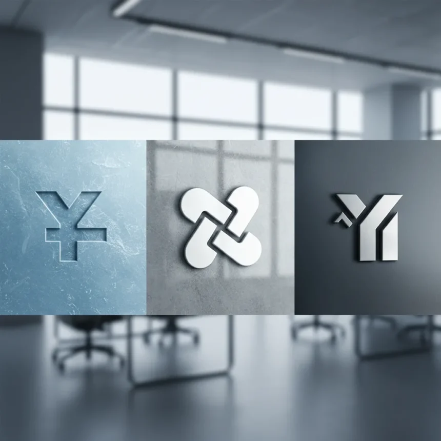
Minimal typography branding has become one of the most overlooked yet powerful tools in modern design strategy. Yeti, the cooler and drinkware brand, demonstrates this principle through its revolving collection of no-name logos that rely almost entirely on typographic treatment rather than pictorial marks or elaborate wordmarks. The brand proves that when typography is handled with precision and intention, a logo does not need a company name prominently displayed to achieve recognition and trust.
Key Takeaways
- Yeti uses minimal typography logos that eliminate traditional wordmarks and company names
- Typographic restraint creates stronger brand recall than visually complex logos
- No-name logo systems reduce visual clutter while maintaining brand identity
- Minimal typography branding works across product categories and markets
- Design simplicity requires more strategic thinking than ornate approaches
How minimal typography branding builds recognition
The core insight behind minimal typography branding is counterintuitive: removing visual elements actually strengthens a brand‘s identity. When a company strips away decorative flourishes, mascots, and explicit naming conventions, the remaining typographic choices become the entire communication strategy. Every curve, weight, and spacing decision must work harder. Yeti’s approach demonstrates that this constraint forces more thoughtful design decisions, resulting in logos that feel distinctive precisely because they do not rely on novelty or complexity to stand out.
Traditional branding wisdom suggests that a logo must include the company name to ensure recognition. Yeti’s no-name logos challenge this assumption. By relying on typography alone, the brand shifts the burden of recognition from visual recognition of a wordmark to the deeper psychological association between a specific typographic treatment and the product experience itself. This works because people recognize brands through repeated exposure to consistent design patterns, not just through reading a company name.
Minimal typography branding versus conventional logo systems
Most consumer brands still use logos that prominently feature their company name, often paired with icons, symbols, or visual metaphors. These traditional approaches assume that explicit labeling is necessary for consumer recognition. Yeti’s strategy inverts this logic. By removing the name entirely and letting typography carry the full branding weight, the company creates a visual system that feels more refined and intentional. The contrast is stark: conventional logos often feel cluttered by comparison, as if they are trying too hard to convince consumers through visual complexity.

This typographic minimalism also scales differently across product categories. A no-name logo system can adapt to different contexts—coolers, drinkware, apparel, accessories—without requiring redesign or rebranding. The typography remains constant while the application changes, creating a cohesive brand presence across diverse product lines. Conventional logos, which often tie the brand identity tightly to a specific visual metaphor, struggle with this kind of flexibility.
Why minimal typography branding requires stronger design thinking
Designing with minimal typography branding is harder than it appears. When every element is stripped away, there is nowhere to hide. A poorly chosen typeface, awkward kerning, or weak letter spacing becomes immediately obvious. Conventional logo design can often compensate for weak typography through clever iconography or visual tricks. Minimal typography branding offers no such escape. The designer must make each typographic decision count, which demands a deeper understanding of how letterforms communicate emotion, quality, and brand values.



This constraint also forces brands to think more carefully about what they actually stand for. If a logo cannot rely on visual metaphors or decorative elements, it must communicate through pure typographic voice. This clarity often results in stronger, more memorable brands because the design reflects genuine strategic thinking rather than aesthetic trends. Yeti’s no-name logos work because they represent a deliberate choice to let the brand’s reputation and product quality speak louder than visual identity alone.
The broader trend toward typographic minimalism
Yeti is not alone in recognizing the power of minimal typography branding. Across industries, brands are moving away from complex, multi-element logos toward simpler typographic systems. This trend reflects both aesthetic preferences and practical realities: simpler logos scale better across digital platforms, adapt more easily to different sizes and contexts, and feel more contemporary to audiences tired of visual clutter. Yeti’s approach is particularly instructive because it goes further than most, eliminating the company name entirely and trusting that the typography itself will carry the brand identity.
This movement also reflects changing consumer expectations. Modern audiences are skeptical of obvious branding tactics. A no-name logo that relies on typographic subtlety feels more authentic and less manipulative than a logo that shouts the company name in multiple formats. By trusting consumers to recognize the brand through design consistency and product quality, Yeti positions itself as confident in its market position—a psychological signal that resonates with audiences.
Can minimal typography branding work for all product categories?
Minimal typography branding works best for established brands with strong market presence and loyal customer bases. Yeti already has brand recognition from decades of cooler manufacturing and recent expansion into premium drinkware. A startup or unknown brand attempting this strategy would face challenges because consumers have no existing association between the typographic treatment and the product. The no-name approach assumes that the audience already knows what the brand represents and simply needs a consistent visual anchor. For emerging brands, some explicit naming or visual differentiation is usually necessary to establish initial recognition.



How does minimal typography branding affect digital marketing and social media?
On social platforms where logos appear at small sizes and in crowded feeds, minimal typography branding can be risky. A no-name logo that works beautifully at large scale on a product or storefront may become indistinct when shrunk to thumbnail size on Instagram or TikTok. Yeti manages this by maintaining consistent typography across all applications and relying on the overall visual system—product photography, color, and contextual placement—to reinforce brand identity. The brand does not depend on the logo alone to communicate recognition; instead, the entire visual ecosystem works together. This requires more sophisticated brand management than traditional logo-centric approaches.
Is minimal typography branding sustainable long-term?
A no-name logo system can endure as long as the brand maintains consistent visual treatment across all touchpoints and the company remains relevant to its audience. The strategy is sustainable because typography itself is timeless—a well-designed typeface does not date quickly the way decorative icons or visual metaphors might. However, the approach requires discipline. If Yeti were to suddenly add a wordmark, change the typeface, or introduce competing visual elements, the entire strategy would collapse. The power of minimal typography branding comes from unwavering consistency, which is both a strength and a vulnerability.
Edited by the All Things Geek team.
Source: Creativebloq