


Sprite rebrand marks the soft drink’s first-ever comprehensive global visual identity overhaul, executed following The Coca-Cola Company’s landmark partnership with WPP. The campaign, called ‘Heat Happens,’ introduces a pared-back logo, new packaging system, and a sonic identity designed to resonate with Gen Z consumers navigating an increasingly polarized world.
Key Takeaways
- Sprite rebrand includes new global visual identity, sonic branding, and Lymon revival after WPP’s $4 billion Coca-Cola deal
- New packaging retains green hue with black font for Zero Sugar variant differentiation
- Campaign targets Gen Z weekly consumption, positioning Sprite as cooling force against ‘heated’ world
- Sprite Chill Mango Citrus flavor available at US retailers in 12-oz cans and 20-oz bottles
- Gradual rollout across 190+ countries where Sprite is sold
What Sprite rebrand actually changes
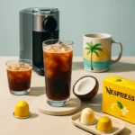
The visual identity system strips away unnecessary complexity while maintaining the brand’s iconic green. The logo becomes bolder and more striking, supported by black typography and packaging for the Zero Sugar line to create visual hierarchy. This isn’t a complete redesign—it’s a refinement. The Lymon, a historical branding element tied to Sprite’s lemon-lime heritage, returns as a central visual component of the rebrand. The sonic identity, newly introduced as part of this campaign, adds an audio dimension to brand recognition across digital and broadcast touchpoints.
Reed Collins, chief creative officer at Ogilvy APAC, described the rebrand as a ‘perfect storm’ of cohesive branding strategy. The scale of this rollout is unprecedented for Sprite—a single, globally consistent brand platform replacing fragmented regional approaches. However, implementation will be gradual across markets, meaning some regions may display the new identity faster than others.
Why Gen Z matters to the Sprite rebrand strategy
The ‘Heat Happens’ campaign frames Sprite as a cooling force in a world perceived as increasingly volatile. Shrenik Dasani, Global Brand Director of Sprite, explained the insight: Gen Z faces constant friction—online arguments escalate quickly, casual conversations turn confrontational, and ambient stress permeates daily life. The campaign argues that cooler heads prevail, and a moment with ice-cold Sprite can help defuse tension.


This positioning diverges from Sprite’s historical ‘Obey your thirst’ era, which emphasized rebellion and authenticity. The rebrand acknowledges that Gen Z’s concerns are fundamentally different—not about individualism, but about managing collective anxiety. By positioning Sprite as a palliative for heated moments, the brand attempts to anchor itself in Gen Z’s emotional reality rather than selling a lifestyle.
Sprite rebrand timing aligns with flavor expansion
The rebrand arrives alongside expansion of Sprite’s product line, particularly the Chill sub-brand. Sprite Chill Mango Citrus, spotted at Walmart in early 2026, combines lemon-lime with mango-citrus notes and has garnered positive reception from consumers who praise its aromatic profile. The flavor follows Sprite Cherry-Lime, which launched as limited in 2024 and became permanent in 2025, signaling Sprite’s confidence in flavor innovation beyond its core offering.

The rebrand’s simplified visual system makes it easier to extend across multiple variants without diluting recognition. Where previous Sprite packaging might feel cluttered across a range of flavors, the new identity system provides clear hierarchy—the core Sprite green remains dominant, while variant colors and Zero Sugar’s black typography create necessary differentiation. This architectural thinking reflects the influence of WPP’s OpenX unit and Turner Duckworth, the design firm executing the rebrand.
How Sprite rebrand compares to competitor strategies
Unlike many soft drink competitors that pursue niche flavor innovation or premium positioning, Sprite’s rebrand centers on emotional relevance and visual clarity. Tropical Sprite, a limited-release strawberry-pineapple-lemon-lime variant available in the US Southeast, represents the kind of regional fragmentation the rebrand aims to consolidate. By establishing a unified global identity, Sprite positions itself as a brand with conviction, not a collection of regional experiments.
What happens next for Sprite’s global rollout
The rebrand will roll out gradually across Sprite’s presence in over 190 countries. No specific timeline has been announced, meaning some markets may see the new packaging months before others. The phased approach reduces supply chain disruption but creates a transition period where old and new designs coexist on shelves. For consumers, this means the Lymon and new sonic identity will become increasingly visible over the coming year.
The success of the rebrand depends on whether Gen Z perceives the ‘Heat Happens’ messaging as authentic rather than corporate co-optation of their anxieties. Sprite’s historical credibility with younger audiences—built through NBA partnerships since 1994—provides foundation, but a rebrand that feels tone-deaf can erode that equity quickly.


Does Sprite rebrand affect taste or ingredients?
No. The rebrand is purely visual, sonic, and strategic. The formula for Sprite and Sprite Zero Sugar remains unchanged. Only packaging design, logo presentation, and brand messaging shift with this campaign.
When will Sprite rebrand reach my country?
Rollout timing varies by market. Sprite is sold in over 190 countries, but the rebrand will implement gradually rather than simultaneously. Check with local retailers for updated packaging availability in your region.
What is the Lymon in Sprite rebrand?
The Lymon is a historical branding element tied to Sprite’s lemon-lime identity, revived as part of the rebrand. It serves as a visual anchor connecting the refreshed brand identity to Sprite’s heritage while modernizing its presentation for contemporary audiences.
Sprite rebrand represents a rare moment of comprehensive brand rethinking at global scale. The combination of visual refinement, sonic identity, and emotionally resonant positioning suggests Coca-Cola and WPP are betting that Gen Z will respond to a brand that acknowledges their world as inherently ‘heated’ and offers moments of cooling clarity. Whether that bet pays off depends on execution consistency across 190+ markets and whether the messaging feels earned rather than opportunistic.
Edited by the All Things Geek team.
Source: Creativebloq


