


Beautiful keyboard design has become a selling point for premium peripherals, but the question remains: does visual appeal translate into a better typing experience? The rise of keyboards marketed primarily on their aesthetic merit reflects a broader shift in how consumers approach workspace accessories—yet this trend masks a critical tension between form and function.
Key Takeaways
- Aesthetically focused keyboards often prioritize looks over ergonomic features that impact daily comfort.
- Premium pricing for beautiful keyboard design typically ranges from mid-tier to luxury segments without performance justification.
- Mechanical keyboards with strong design credentials still require switches, stabilizers, and layout that match your actual workflow.
- Beautiful keyboard design appeals to creative professionals and remote workers who value workspace ambiance.
- Comparing design-first keyboards to task-optimized alternatives reveals significant trade-offs in functionality.
Why Beautiful Keyboard Design Matters Right Now
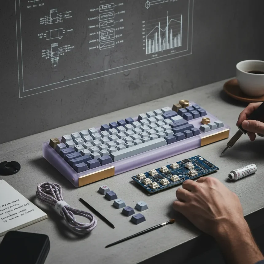
The market for beautifully designed keyboards has exploded because remote work made our peripherals visible—they’re no longer hidden under desks. Designers and creative professionals now treat keyboards as part of their workspace aesthetic, not just functional tools. This shift has created a niche where manufacturers can charge premium prices for keyboards that look exceptional but may compromise on practical features like wrist support, programmable keys, or layout versatility.
The problem is straightforward: a keyboard that looks stunning in marketing photos might feel cramped during an eight-hour workday. Beautiful keyboard design often means slim profiles, minimalist layouts, and unconventional key arrangements that prioritize visual harmony over ergonomic sense. When you’re choosing between a keyboard that matches your desk’s color scheme and one that prevents repetitive strain, form should not win by default.
What Beautiful Keyboard Design Actually Delivers
Keyboards marketed on beautiful design typically excel at three things: color coordination, build material quality, and visual minimalism. Manufacturers use premium plastics, aluminum frames, or wooden elements to create products that photograph well and feel solid in hand. The tactile satisfaction of typing on a well-built keyboard is real—but it is not the same as comfort or efficiency.


Many beautifully designed keyboards sacrifice practical features to maintain their aesthetic vision. Compact layouts remove the numpad, arrow keys, or function row entirely. Some eliminate backlighting to preserve a clean appearance. Others use stabilizers that sound excellent but require frequent maintenance. These are not accidental compromises; they are deliberate design choices that prioritize visual purity over user convenience.
The real question is whether the aesthetic appeal justifies the trade-offs. If you spend eight hours daily on a keyboard, ergonomic features matter more than whether it coordinates with your monitor. A keyboard that looks beautiful but forces your wrists into awkward angles is a poor investment, regardless of its design credentials.


Beautiful Keyboard Design vs. Functionality-First Alternatives
Task-optimized keyboards—those designed around productivity workflows—take a different approach. They prioritize programmable keys, ergonomic curves, split layouts, and customizable macros. These keyboards rarely win design awards. They are often bulky, asymmetrical, and available in limited color options. But they deliver measurable improvements in typing speed, accuracy, and comfort for professionals who depend on their keyboards for income.
The comparison reveals a fundamental trade-off: beautiful keyboard design requires visual restraint, which often means reducing features. A minimalist keyboard with a clean aesthetic cannot also include a full macro layer, programmable RGB lighting, and an ergonomic wrist rest without compromising its visual identity. Manufacturers must choose, and design-first brands consistently prioritize looks.
For casual users who type emails and browse the web, this trade-off might be acceptable. The aesthetic pleasure of using a beautiful keyboard could outweigh the minor ergonomic compromises. But for writers, programmers, and designers who type constantly, a functionally optimized keyboard delivers far more value, even if it looks utilitarian.
The Price Problem with Beautiful Keyboard Design
Premium pricing for beautiful keyboard design often lacks justification beyond the visual appeal itself. Mechanical keyboards with exceptional design can cost twice as much as functionally superior alternatives. You are paying for the designer’s vision, the material quality, and the exclusivity—not for performance improvements that benefit your workflow.


This is not inherently wrong. People spend premium prices on beautiful objects in every category—furniture, lighting, cookware. But it requires honest acknowledgment: you are buying an aesthetic experience, not a productivity tool. If that trade-off feels right for your workspace and budget, proceed with clarity about what you are actually purchasing.
Who Should Actually Buy a Beautifully Designed Keyboard?
Beautiful keyboard design makes sense for specific user profiles. Creative professionals who work in design, content creation, or other visual fields often benefit from workspace aesthetics that inspire focus and reflect their professional identity. Remote workers who appear on video calls gain value from equipment that looks intentional and curated. People who work in shared spaces or coffee shops might appreciate keyboards that feel like personal statements rather than generic peripherals.
These users are not making irrational choices. They understand the trade-offs and accept them because the aesthetic and tactile experience genuinely enhances their daily work environment. The key is making that choice consciously rather than defaulting to beautiful keyboard design because marketing convinced you that looks equal quality.
Does beautiful keyboard design justify the cost?
Not automatically. Beautiful keyboard design justifies premium pricing only if you value the aesthetic experience enough to accept functional compromises. If you type for hours daily and need maximum comfort and efficiency, a task-optimized keyboard will deliver more value despite looking less impressive. Evaluate your actual needs—not the aspirational image of how you want your workspace to appear.
What features matter more than beautiful keyboard design?
Switch quality, stabilizer performance, key travel distance, and layout ergonomics matter far more than aesthetics if you use a keyboard professionally. A keyboard with poor stabilizers will rattle regardless of how beautiful it looks. A cramped layout will slow your typing speed. Backlighting you cannot customize becomes frustrating in actual use. Prioritize function, then layer aesthetic choices on top of a solid foundation.
Can a keyboard be both beautiful and functional?
Yes, but it requires compromise on both sides. A designer must accept some visual complexity to accommodate ergonomic features. A user must accept that maximum functionality rarely achieves minimalist beauty. The best keyboards in this category blend thoughtful design with practical features—they look intentional without sacrificing usability. These exist, but they cost significantly more because they solve a harder design problem.
Beautiful keyboard design is not a flaw—it is a legitimate design philosophy that appeals to people who value their workspace environment. But it should never be your primary decision criterion if you depend on your keyboard for work. Assess your actual typing habits, ergonomic needs, and daily workflow first. Then, if multiple keyboards meet those functional requirements, choose the one that looks best to you. That is the honest way to buy a keyboard that serves both your productivity and your aesthetic sense.
Where to Buy
$185 over at Amazon | WhiteFox Eclipse: | $99 to be exact
Edited by the All Things Geek team.
Source: Creativebloq