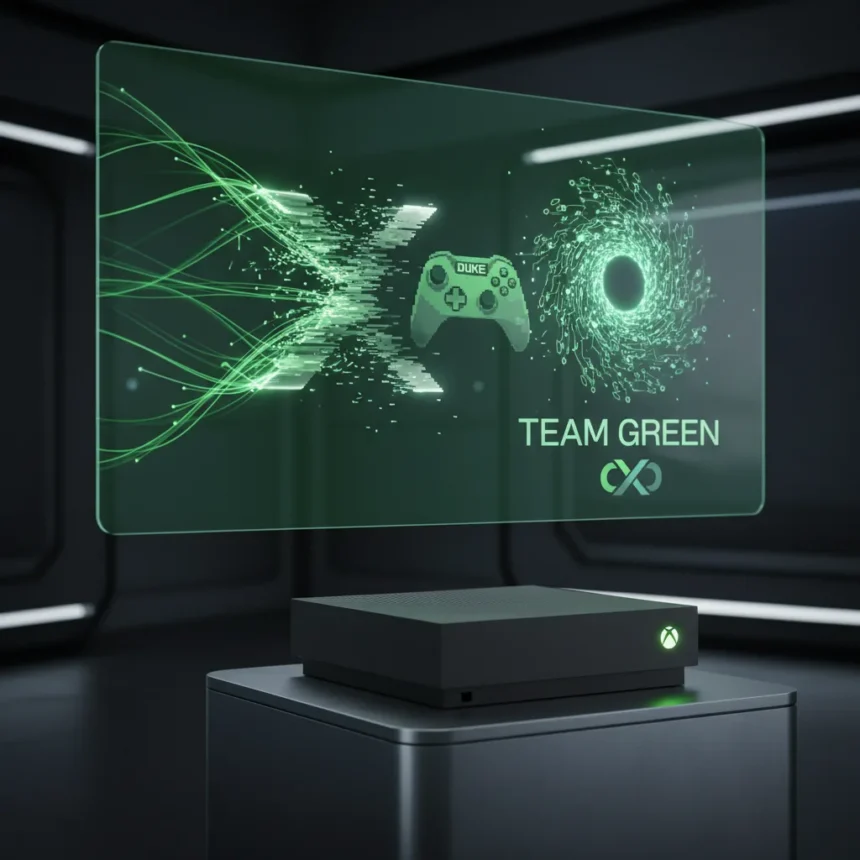
The Xbox boot animation brand refresh is a deliberate visual statement about where Microsoft wants to position its gaming division. While many players dismiss startup animations as throwaway moments, they are actually one of the first touchpoints a consumer experiences with a brand—and Xbox is leaning hard into that moment to reestablish its identity around nostalgia and the return of Team Green branding.
Key Takeaways
- Xbox boot animation brand refresh emphasizes nostalgia and Team Green identity return
- Visual rebrand signals broader strategic repositioning beyond hardware specs
- Startup animations influence brand perception despite being brief moments
- Nostalgic design elements appeal to long-term Xbox ecosystem players
- Boot-up visuals reflect Microsoft’s shift in console marketing strategy
Why Xbox’s Boot Animation Matters More Than You Think
A boot animation takes seconds. Most players barely register it. Yet Microsoft is investing creative resources into redesigning this moment, which reveals something important about current Xbox strategy: the company is fighting perception battles, not just hardware battles. The Xbox boot animation brand refresh is not about making consoles start faster—it is about making the Xbox brand feel like home to players who grew up with the original green startup screens.
Nostalgia is a powerful marketing tool in gaming. Nintendo built an entire ecosystem around retro aesthetics and callbacks to 8-bit and 16-bit eras. Sony leans into PlayStation’s design heritage through subtle visual references. Xbox, by contrast, spent years chasing latest minimalism and corporate polish. The boot animation brand refresh reverses that trajectory, signaling that Microsoft understands what long-term Xbox players actually value: recognition and continuity with the brand’s history.
Team Green Returns: What the Rebrand Signals
The return of Team Green branding is the clearest signal that Xbox is repositioning itself around legacy and community identity rather than pure technical specifications. Team Green was Xbox’s original competitive identity—bold, slightly irreverent, and distinctly different from PlayStation’s sleek corporate image. By reintroducing this visual language in the boot animation brand refresh, Microsoft is essentially saying: we remember who we are, and we want you to remember too.


This matters because Xbox has spent the last five years in a precarious position. Game Pass subscriptions are strong, but hardware sales lag behind PlayStation 5. The boot animation brand refresh is one of several moves designed to rebuild emotional investment in the Xbox ecosystem rather than just transactional engagement. A player who feels nostalgic about the Team Green era is more likely to stick with Xbox across multiple generations.
How Visual Branding Shapes Console Loyalty
Console loyalty is not purely rational. A player does not choose PlayStation 5 over Xbox Series X because of a 12% GPU performance difference—they choose it because of ecosystem, social networks, and emotional attachment. The Xbox boot animation brand refresh acknowledges this psychological reality. Every time a player powers on their console, they see a visual reminder of why they chose Xbox in the first place.
Compare this to how Nintendo handles the Switch startup: the console greeting is iconic, instantly recognizable, and deeply tied to Nintendo’s brand identity. Microsoft is attempting something similar with the boot animation brand refresh, repositioning Xbox’s visual language as equally distinctive and memorable. Whether this translates to measurable business impact remains to be seen, but the strategic intent is clear: make the Xbox experience feel intentional and identity-driven, not just feature-driven.
Does the Boot Animation Brand Refresh Change Anything?
A prettier startup screen will not fix Xbox’s real challenges: exclusive game libraries remain limited compared to PlayStation, and Game Pass quality varies significantly. The boot animation brand refresh is a surface-level fix to a deeper problem—but it is not a meaningless one. Small design touches accumulate. They shape how players perceive a brand over months and years of interaction. If Microsoft executes the broader brand refresh strategy with the same intentionality it applied to the boot animation, the cumulative effect could matter.
The boot animation brand refresh also signals that Microsoft is listening to community feedback about Xbox’s identity crisis. For years, Xbox fans complained that the brand felt corporate and disconnected from its roots. This visual change is Microsoft saying: we hear you, and we are bringing back what made Xbox feel like Xbox.
What About Performance and Functionality?
The boot animation brand refresh does include functional improvements alongside the visual redesign. Earlier Xbox updates trimmed boot times by several seconds through optimized startup sequences, and this redesign likely maintains or improves those gains while adding the nostalgic visual layer. The goal is not to slow down the startup experience in service of aesthetics—it is to make a faster startup feel more intentional and branded.


Is the Xbox boot animation brand refresh enough to matter?
On its own, no. A boot animation cannot save a console generation. But as part of a larger brand repositioning strategy, it sends a signal: Xbox is remembering its identity and rebuilding around what made the brand distinctive. If this visual refresh is paired with stronger exclusive games, better Game Pass execution, and continued investment in the ecosystem, it becomes a piece of a larger puzzle. If it stands alone as a cosmetic change, players will forget about it within weeks.
How does the new boot animation compare to previous Xbox startup screens?
The new Xbox boot animation brand refresh directly references the original Xbox startup aesthetic—the green color palette, the geometric shapes, and the overall visual language. Previous generations moved toward minimalism and corporate design language. This refresh is a deliberate step backward visually to move forward strategically, reconnecting with what made early Xbox feel distinctive in a crowded console market.
The Xbox boot animation brand refresh is ultimately a bet on nostalgia and identity in an industry increasingly focused on services and subscriptions. Whether it moves the needle on console sales or Game Pass subscriptions is unknowable from a design change alone. What is clear is that Microsoft is no longer content to compete purely on horsepower—it is competing on belonging, and that shift in strategy might matter more than any hardware spec ever could.
Edited by the All Things Geek team.
Source: Windows Central