Charli XCX buries Brat with a minimalist new single cover that strips away everything the neon green phenomenon represented. Where Brat screamed with fluorescent fury and intentional ugliness, the new cover whispers—or says nothing at all. This is not a subtle evolution. It is a deliberate rejection of the aesthetic that consumed pop culture for an entire summer.
Key Takeaways
- Charli XCX’s new single cover marks extreme minimalism compared to Brat’s viral neon green anti-design aesthetic.
- Brat’s iconic green cover was initially a cost-saving measure, born from budget constraints and low expectations.
- The Brat album spawned a cultural phenomenon: “brat summer,” brand replications, political campaigns, and SNL sketches.
- Brat cover designed by Brent David Freaney at Special Offer, Inc., developed over five months starting June 2022.
- Charli XCX chose the green specifically because it was “disgusting,” “gross,” and “un-cool”—a deliberate provocation.
How Brat Became a Cultural Juggernaut
The Brat album landed in June 2024 as Charli XCX’s sixth studio album, but its cover art became the story. A simple black lowercase “brat” stretched across a fluorescent lime-green background—blurry, low-resolution, deliberately cheap-looking. It was the anti-design move in a sea of glossy, polished album aesthetics. Fans initially balked at the absence of Charli’s image, but the cover soon became inescapable.
What started as a budget hack became the defining visual identity of summer 2024. The Brat aesthetic spawned “brat summer,” a cultural moment that rippled across music, fashion, politics, and brand marketing. The Sims created Brat-coded content. Gucci replicated the green. The UK Green Party adopted the look for campaign materials. Kamala Harris’s presidential campaign borrowed the aesthetic. Saturday Night Live built a sketch around it. The cover was so ubiquitous that it felt less like album art and more like a cultural mandate.
The Brat Cover Was Born From Doubt
Here is where the mythology gets interesting: Charli XCX revealed in an October 2024 interview with Zane Lowe on Apple Music that the entire text-only concept stemmed from pragmatism, not artistic vision. “The actual first idea of doing a text cover came from wanting to save money,” she explained. “Because I was like, this album is not going to appeal to a lot of people. I think I thought maybe I’d do a press shoot and then save on the album cover and maybe it’s like cool”.

The green itself was chosen as an act of defiance. Charli described the color as “disgusting,” “quite gross,” “un-cool,” “un-trendy,” and “un-pleasant”—a calculated pop art gesture designed to provoke debate rather than charm. The blurriness was not an accident either. She created the cover at home using phone mock-ups, and the low-resolution file was intentional, evoking carelessness and youth culture’s digital vernacular. The design was eventually formalized by Brent David Freaney at Special Offer, Inc., with art direction from Imogene Strauss and Charli herself, developed over five months starting in June 2022.
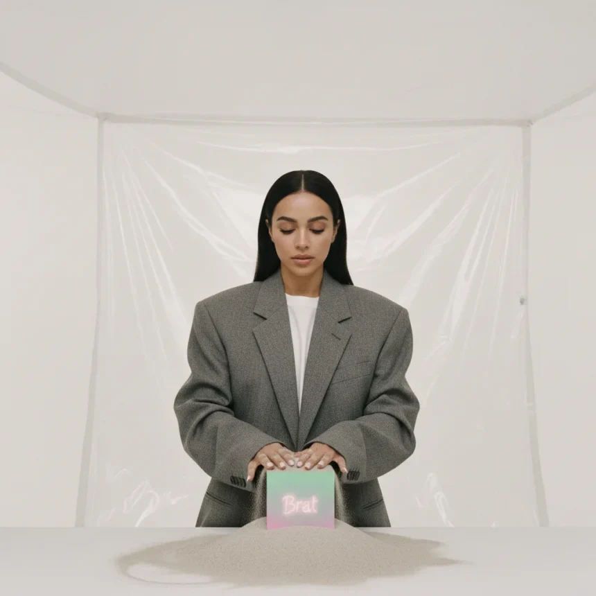
Charli XCX Buries Brat With Stark Simplicity
Now Charli XCX buries Brat with a new single cover that exists at the opposite end of the design spectrum. Where Brat was aggressively anti-design—loud, neon, distorted—the new cover embraces ultra-minimalism. The specifics remain sparse, but the contrast is unmistakable: this is the visual equivalent of silence after screaming. It signals a shift away from the Brat era entirely, even as remix albums and collaborations keep the cultural moment technically alive.


This move raises a design question worth considering. Brat succeeded precisely because it was ugly, cheap, and unapologetic. It broke every rule of premium album packaging. The new cover breaks rules in the opposite direction—by offering almost nothing to look at. Both are provocations, but they provoke different reactions. Brat invited fans to participate in a meme, to replicate the green, to make it their own. The new minimalist approach offers no such invitation. It is closure.
What the Shift Reveals About Artist Control
Charli XCX’s candid admission that Brat’s cover was born from budget anxiety—not artistic conviction—complicates how we read the album’s success. The cover worked not because it was a calculated masterpiece but because it felt authentic to a moment of cultural chaos and youth rebellion. Its “ugliness” was its honesty.
Yet Charli has also been vocal about rejecting the pressure to appear on her own album covers. She called fan demands for her image on past covers “misogynistic and boring.” The text-only approach on Brat—and now the even starker minimalism of the new single—represents a refusal to feed that demand. Whether born from budget constraints or artistic principle, the result is the same: Charli’s face is absent, her presence defined by absence. The new cover doubles down on this absence, burying Brat’s neon distraction beneath pure simplicity.
Why Brat’s Moment Had to End
Cultural phenomena have shelf lives. Brat summer was intense, viral, and utterly exhausting. By autumn 2024, the green was everywhere—on billboards, in brand campaigns, in political messaging. The saturation inevitably drained its power. A remix album, Brat and it’s completely different but also still brat, dropped in October 2024 to extend the moment, but even that felt like a coda rather than a continuation.


Charli XCX buries Brat because the era needed to end. The new single cover is not a rejection of Brat’s success—it is an acknowledgment that lightning does not strike twice. By moving to extreme minimalism, Charli signals that what came next will be different. The Brat moment was real, it was wild, and it is over. The cover reflects that closure with brutal honesty.
Did Charli XCX regret the Brat cover’s budget origins?
No. In her interview with Zane Lowe, Charli framed the budget constraint as a happy accident that “punctuates that pattern in quite a nice way” and breaks her pattern of appearing on every album cover except the 2016 EP Vroom Vroom. She also noted it was “handy because it’s going to be a lower spend.” The cost-saving measure became her most iconic visual statement.
How did brands replicate the Brat aesthetic?
Major brands including Gucci, The Sims, and the UK Green Party adopted the lime-green and minimalist text approach for their own campaigns and content, recognizing the visual language’s cultural resonance. The Brat look became so recognizable that brands could invoke it instantly to signal cultural relevance and youth appeal.
What fonts were used in the Brat album packaging?
The cover featured stretched low-resolution Arial; vertical labels used ABC ROM Mono; inner sleeves used LL Unica77; and the back cover “charli xcx” text likely used ITC Avant Garde Gothic. The font choices reinforced the deliberately cheap, DIY aesthetic of the overall design.
Charli XCX buries Brat not out of shame or regret, but out of necessity. Cultural moments die so that new ones can begin. The new minimalist single cover is the tombstone—stark, simple, and impossible to ignore. It closes one chapter and leaves the next one blank.
Edited by the All Things Geek team.
Source: Creativebloq